Deep Rich Colors
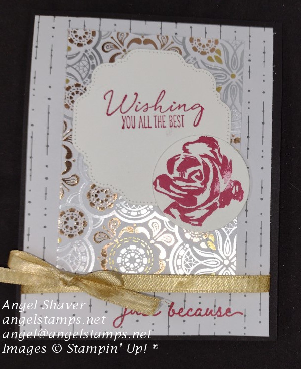
When you looking for a way express your concern for others what colors do you gravitate toward? Deep, rich colors always seem to catch my eye. In the Stampin’ Up!® color world, that means gravitating toward the Regals with the addition of some neutrals.
What about you?
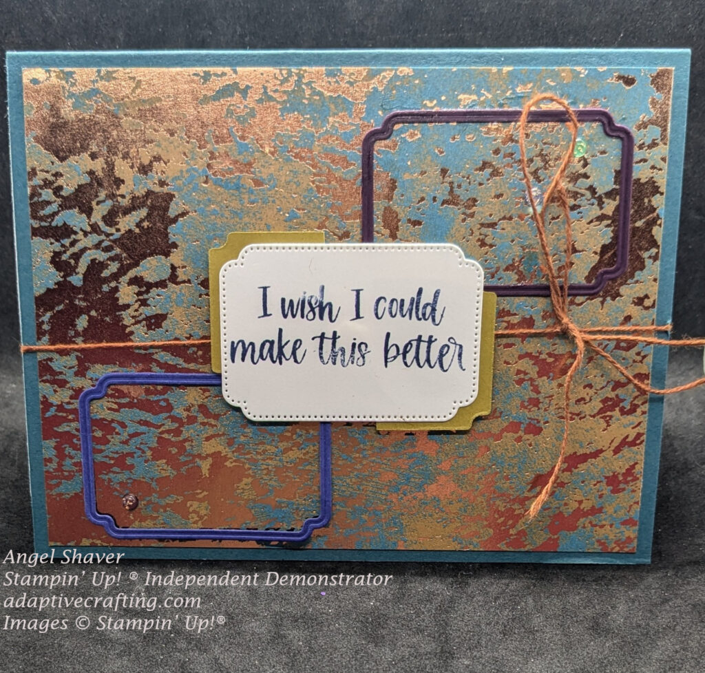
Card Details
Do you want to focus on the sentiment for your card, but want to create some interest around it? I want to turn your crafting stress into success.
Choose a label die that works with your sentiment and then cut out that frame or die shape in other coordinating colors and stagger them diagonally across the card. Next cut the same die cut shape in a coordinating color, cut it in half, and adhere it behind the sentiment label to create interest. Elevate the sentiment label with dimensionals to help make it the most important element on your card.
Frame dies don’t actually have to frame anything. They can be used to just create interest and dimension on your card. Check out the Unbounded Love Dies to see lots of options for frames and sentiment labels.
Click here to see and purchase products used to create this card.
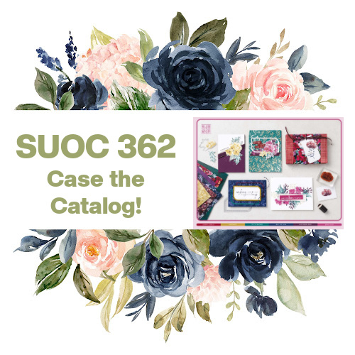
This card was made for Stampin’ Up! Only Challenge 362: Case the Catalog. I chose to CASE both the rich colors used here as well as a sketch. I hope you are inspired by this catalog page and will create something gorgeous and then share it with us at SUO Challenge 362. This challenge is open through Sunday, October 20. Join us at SUOC362.

Host code for
| April 1-13 is ZKNT7CQZ |


Lovely card, Angel! Cool ways to use the label punches!!
Thanks Tammy. Those are actually dies from the UnBounded Love set, but you could totally do the same thing with the label punches!!