Pop of Color
Does you world sometimes seem like shades of grey, black, and white? Do you purposefully put those colors around you? Do they match your mood? What happens when you add a pop of color?
Sometimes, lots of bright, vibrant colors is what we need and enjoy. But sometimes, if we’ve been in a black and white world (or mood) long enough, just one extra pop of color is enough.
And, that pop of color doesn’t have to be bright and vibrant. It can be whatever you need at the moment: soft, subtle, rich, regal, calming, etc.
Card Details
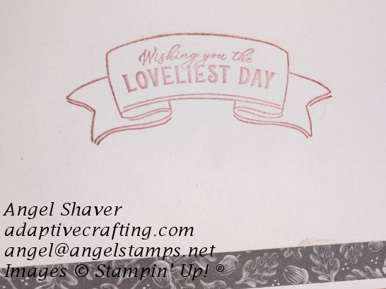
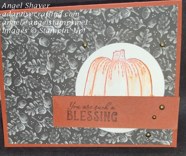
This card was made with a black and white patterned paper layer and one other color. Using the same color for the card base, pumpkin ink color, and sentiment strip really makes them pop against the black and white background. This card uses Cajun Craze as the pop of color and to highlight the pumpkin.
What does this added color make you feel? For me, it brings warm and cozy feelings. It makes me think of fall outside while I’m snuggled up in a warm and cozy blanket by the fire.
Click here to see and purchase products used to create this card.
Video Tutorial
Other Blog Posts About Color
Does Combining Colors Scare You?
Video: Shades of Purple
No White Paper?
Christmas Colors
September Featured Stamp Set Blog Posts
Time for Fall
Simple Hello Harvest
Elegant Celebration
Double Diagonal Fun Fold

Host code for
| April 1-13 is ZKNT7CQZ |


